CULC Pal
A kiosk application designed for students in Georgia Tech with the goal of enhancing their study space finding experience.
ROLE
Front End / UX Research / UX Design
Agency
HCI Course Project @ Georgia Tech
Date
8 - 12 / 2016
Summary
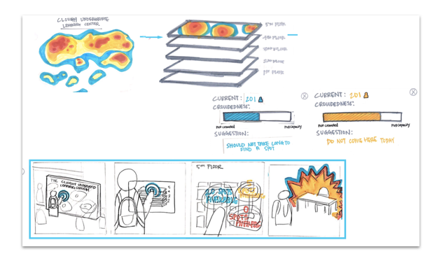
The Clough Undergraduate Learning Center (CULC) is a popular study destination for students in Georgia Tech. The CULC Pal is designed as a kiosk placed in the CULC to assist students who choose to study there find an available spot to work in a shortest amount of time.
As the first semester-long project in HCI @ GaTech, this project equiped me with experience of user research, ideation, UX design and all the way to prototyping. As the only developer, I built an interactive web prototype using HTML/CSS/JavaScript.
Phase 1: See the painpoint - user group & problem space
Contextual-Inquiries | Interviews | Affinity Diagram | Hierachy Task Analysis | Storyboard | Persona
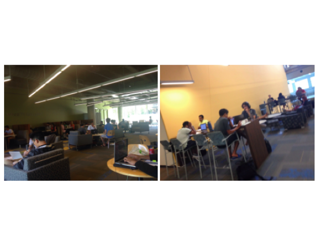
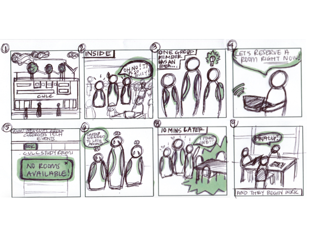
The project began when my team were just newbies at Georgia Tech. It didn't take long when we found that a building called CULC ( the Clough Undergraduate Learning Commons ) is the most popular study destination for students with its central location and variety of resourses.
But we always heard complaints (and had them too). A common challenge for students is finding available seating in the CULC that fits each student’s needs and requirements. This challenge can be even more frustrating during certain times of the day or year, when the CULC is crowded. Therefore, we decided to discover how to prevent students from wasting precious study or work time by searching for a location that meets their needs.
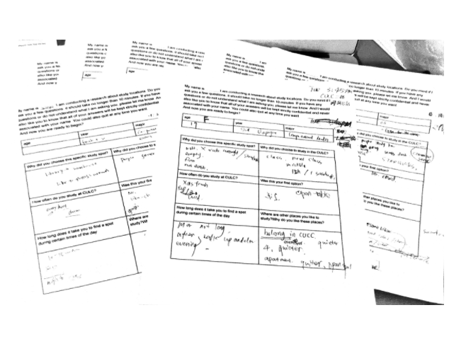
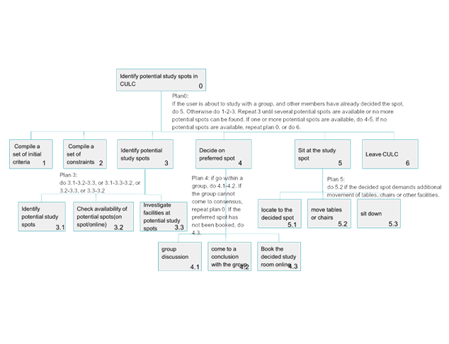
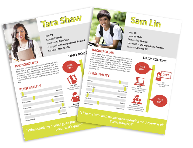
The research process began with #Observations and #Contextual-Inquiries in the target space to study how students use the space and resources within it. We conducted #Semi-structured Interviews and #Hierachy Task Analysis to understand the thought process of our target users in how they find a seat. We created behavioral #Personas / Composite Character Profiles based on the interviews rather than traditional personas. Behavioral personas tell us what our users do and how well they work with the current system to find a studying spot.
Through the user research process, we were able to target the pain points.
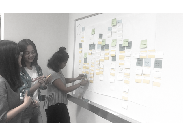
From the user research we could summarize the following Findings, and see the findings as the design directions.
- A good number of students are used to studying at CULC. The reasons include the good location of CULC, the 24/7 openning, the resources, interior design and studying environment here. Some students mentionded that it was a common sense to study at CULC.
- However, Students have difficulty looking for a spot especially at certain periods like weekday evenings, dead week, days before a break.
- Students have their own process of choosing a studying spot. Some of them just go with the first spot that they see. Some of them will always check their favorite spots and see whether they are taken.
- Students have their own requirements when choosing a studying spot. CULC current provides all kinds of studying spot for students. Among them, plugs are the most frequently required facilities.
- Some students would like to study with others so they can discuss problems in the CULC. Some students mentioned that they wanted to meet other students who could discuss the problems of a course together with. And they don’t mind whether they know them before or not.
Phase 2: Expand, and then shrink - design alternatives
Brainstorm | Ideation | Storyboard | Paper prototype
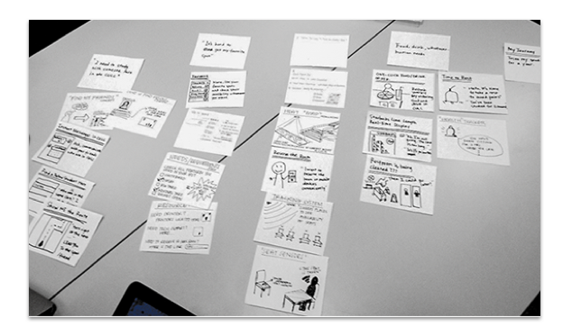
Design is based on evidence. The design directions driven by our user research led us to develop a set of design alternatives. We held two brainstorming sessions in group and coming up with more than 30 ideas generated based on the insights from previous research. After that, we converged into three main ideas to go further.
How should we make the design decision? Based on evidence again. My team gathered feedback and votes from an in-class sprint when we presented the paper prototypes and walked through the example scenerios. We also conducted the evaluation of all the dimensions of the three alternatives, including feasibility, cost of money, time investment, usability, interaction, cognition, and creativity. Taking the features and constraints of each interesting idea, we picked out the kiosk idea and continue to prototyping and development.
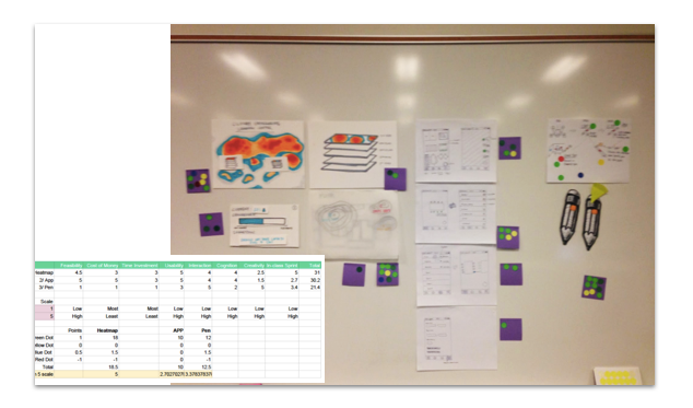
Dream big – and then set realistic goals. I understand that user experience is never quantified as engineering index. But still, based on group evaluation and feedback from pioneer users, the design decision could be solid.
Phase 3: Design & Prototype - pearl formed and refined
Mindmap | Wireframing | UI design | Principle app
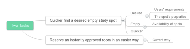
At this stage we worked on nailing down the details of the kiosk heatmap concept. The findings gathered from previous user research continued helping guide the design process. These findings and insights focus on the tasks we aim to answer through our design.
Finding 1
Users are used to studying at CULC.
Insight 1
Given that CULC is a popular location for a lot of students to study, our problem domain seems to have value.
Finding 2
The users are have their own requirements of a studying spot.
Insight 2
In our design, we should show the users real-time availability of study spots. This information should be well-organized and clearly presented. The properties and facilities of the spots should also be presented.
Finding 3
Users have issues with the existing design of the “Reserve-a-Room” tool.
Insight 3
Seeing that the “Reserve-a-Room” manages spaces within the CULC, it relates to our problem spaces and could be improved to improve the overall experience of the CULC.
To be able to test if our designs are effective in answering the problem scope, we developed a list of usability criteria and principles to evaluate our designs. We formed these principles to be similar to the Apple iOS Human Interface guidelines. With a combination of acknowledging these principles and having potential solutions to guide how we might address potential issues, these guidelines assisted us in developing appropriate solutions that meet the needs of our users.
Principle 1: Appearance
- Clearly displays visual content (maps, directions) so that it is easy to interpret
- Pleasing to users
- Potential Solution: Aesthetic and minimalist design that provides clear directions/instructions
Principle 2: Consistency
- Predictability between different levels of the interface
- Potential Solution: Interface levels for different locations is the same in regards to text, visuals, symbols, instructions, interactions, etc.
Principle 3: Feedback
- Direct manipulation when navigating through and/or interacting with content
- Acknowledges actions and updates results to accurately inform users
- Potential Solution: Match between system and real world by accurately updating occupation of sets in a timely manner (as soon as a seat is vacant, it appears available in the system)
Principle 4: Simplicity
- Simple and efficient so that it is less time-consuming to find a spot
- Potential Solution: Be able to find and sit in a spot in under 3 minutes (including navigating through the interface)
Principle 5: Structure
- Recognition rather than recall
- Avoid users from having to learn how to use a new system/interface
- Potential Solution: Interface is familiar to use because it is similar to interface(s) users are already exposed to
Principle 6: Tolerance
- Should not malfunction during critical situations (midterms, finals, hell/dead week)
- Potential Solution: Method where users can recognize, diagnose, and recover from system error by themselves or through IT support group; more IT support during critical times to monitor system; back-up system that still relays information, potentially in a different method
- Should be able to tell what is occupying a seat/li>
- Potential Solution: Differentiating between a person sitting or a bag that could be moved Should address certain constraints users have when choosing a space
- Potential Solution: Features customizable to meet the requirements users have for a seat location
Principle 7: Accessibility
- Available and usable to all users who utilize the location by harnessing resources provided
- Potential Solution: Harness GT wifi to monitor and function interface
- Responsive design for different technologic devices
- Potential Solution: Available on multiple technologies that GT students have (assumption that everyone has access to a computer)
Principle 8: Ethics
- Comfortability of users while being monitored
- Potential Solution: hrough surveys and interviews see what makes target users’ attitudes towards monitoring them within the confines of the building; understand what limits users feel should not be crossed and maintains within their comfort level before continuing with monitoring concept
-
Specific Principles To Design a Kiosk
In order for a kiosk user interface to be “touch-friendly,” it must allow users to navigate comfortably using only their fingers without the need for a mouse and keyboard. These principles are concluded from investigating existing kiosks and articles.
Keep everything simple
The kiosk is not supposed to engage users when they complete a task. Besides, users also tend to not read blocks of text very closely, so icons, pictures, sounds, and animations are important.
Buttons should be “fat finger” friendly:
To prevent “fat finger” problems, we need to make buttons larger with sufficient spacing between.
Screens should be clean, free from clutter and too many options on a single screen
A cluttered kiosk user interface will distract the user from completing their tasks. So in our design, the designer avoids soliciting the user for too much information on a single screen.
The kiosk should be snappy and respond as quickly as possible
If there is some processing or working logic that is happening then some sort of indicator needs to be relayed to users.
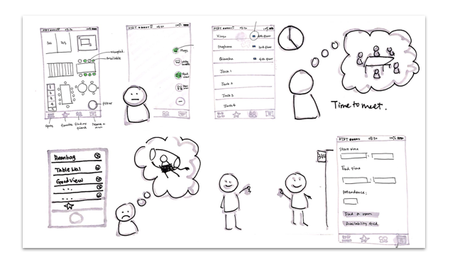
User Experience Design
Starting with mindmap and wireframing, our team created prototypes for a touch-friendly kiosk-based system to be placed in CULC.
UI Design & Prototyping
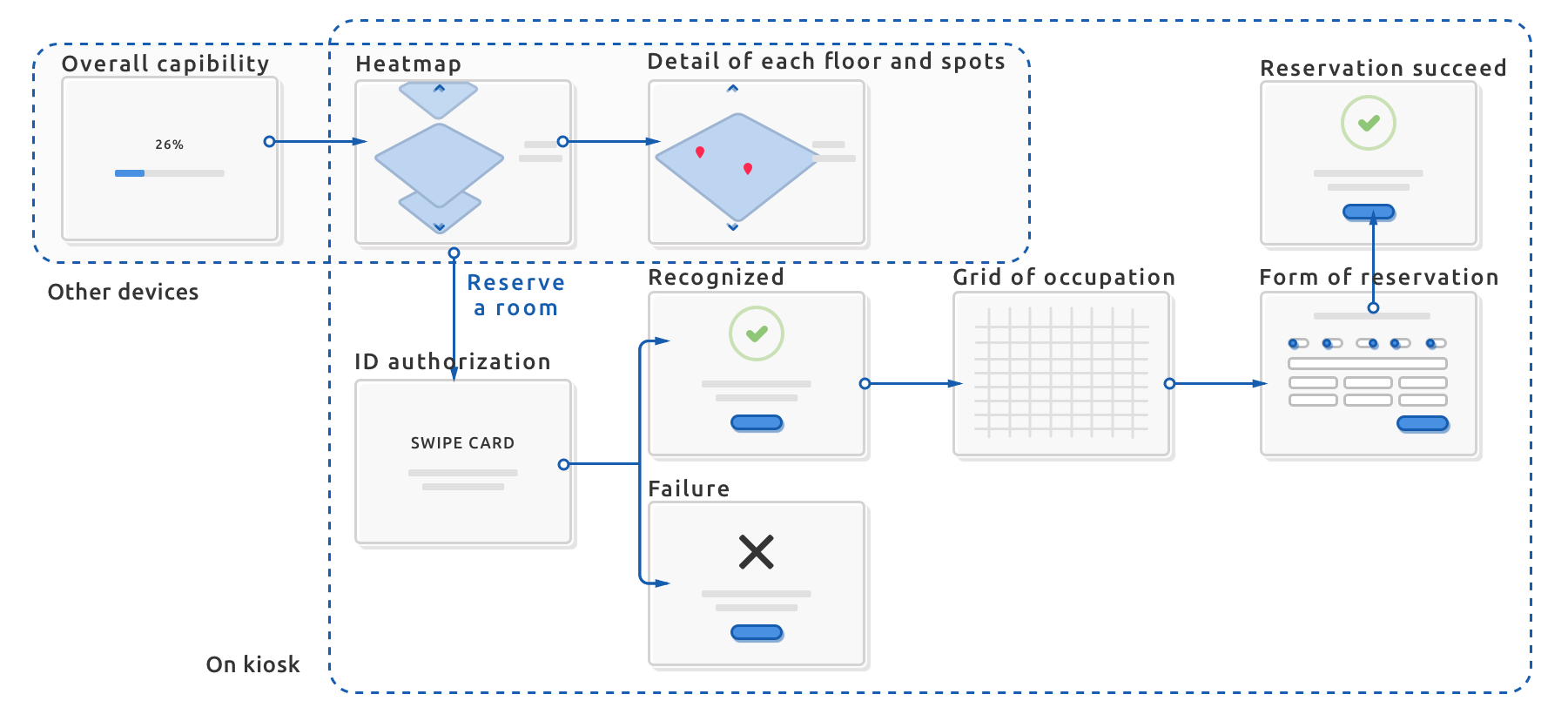
At this stage our team worked closely to prototype the navigation system, when I acted as the front-end developer to construct the protoype and discussed with my teammates time to time.
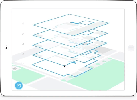
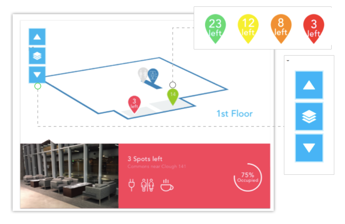
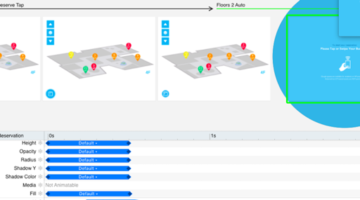
We abandoned the idea of a real heatmap - as it is a holistic visualization. Instead, we kept the idea of using colors to indicate crowdness, but rather colorful pins with universal icons and numbers that show the exact amount of spots.
Another task using our system is to reserve a room at CULC. For this part we built protoype via Principle.
Phase 4: Development - create cool stuff
Front-end engineering | CSS3 animation | JavaScript | SVG
As the only developer, I developed the interactive web prototype using HTML/CSS/JavaScript.
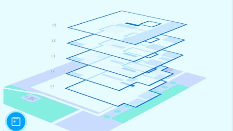
The functional prototype was developed as a responsive webpage. The floor map are represented by inline SVGs, created in Sketch. CSS attributes were applied for transitions that will rotate and move the floors. The ‘up’ and ’down’ buttons enable the user to navigate upstairs or downstairs through the different floors of the CULC. The “stack” button leads the user to the overview page, which shows all the floors in the building. The pins were also initially SVGs with the same dimensions of each floor. Clicking on a pin will open the details for that common space. The interactions are implemented using JavaScript, including Event-listener to all the pins.
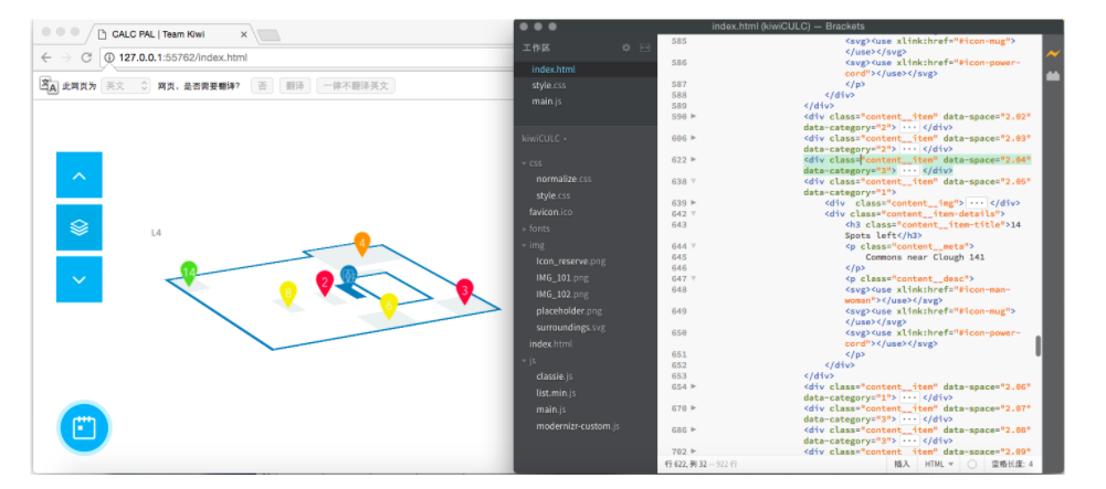
The project was hosted on Github. Don't forget to try it here !
Phase 5: Evaluation - meet audience's expectation
Heuristic evaluation | Iterations
The objective of our evaluation is to find out how well users understand the visualization, whether the users get the information they need. And basically whether our installation would help them find spots to study successfully.
Our Heuristic evaluation was on the final presentation of the course. More than 20 experts made their comments on the design. They evaluated our design by referring to some common heuristics with a focus on usability, understandability, learnability of the system.
Here are the iteration directions we gathered based on the feedback.
- "You are Here" needed: A pin showing the current position of the kiosk would aid users perceive the direction and geographic location.
- Real-time Photos: The pictures of the common areas should be in real-time, so that the crowdedness conveyed by the photo could be consistent with the number of empty seats shown beside the photos. Users feel confused when the actual space and the shown photo are not consistent, because the photo remains the same all the time.
- Legend needed: A legend showing the color decoding should be placed in the visualization, helping users understand the 'heatmap' concept.
- Unclickable icons and pins: In the detailed view of the floor plans, only the pins for study commons areas were clickable. What's more, unclickable icons are used to express available resources in the detailed content of each common area. During the evaluation, many users tried to click those pins and icons. Therefore, we reconsidered the UI design of the pins for navigation and for resources.